STOKE CITY fans were left panicking after seeing a potential new badge design - but DON'T have to worry.
It comes as the club hinted that the current crest could be set for a revamp.

The Championship side got supporters talking when they released a mysterious post on social media.
It showed an image of what appeared to be a simplistic badge and it left many wondering whether it could be a new Stoke crest.
Stoke-on-Trent is well-known for its rich history in ceramics for centuries.
 Putin accused of surrounding himself with same 'actors' at series of events
And this apparent launch more than makes a subtle nod to that industry as it features an image of a tower that has been inspired by their world famous pottery villages.
However, the new potential badge has gone down as a huge own goal with supporters.
One responded to the news with: “Surely not ahahaha, that’s the worst badge in football history. I’d genuinely boycott the club if I supported them.”
Another said: “It really annoys me when clubs change their badges based on a few fans who complain and then the club thinks the whole fan base hates the badge.”
A third commented: “It just stinks.”
BEST FREE BET SIGN UP OFFERS FOR UK BOOKMAKERS
While a fourth said: “Unlucky Stoke, as Leeds fans we know what this is like.”
That is referring to when Leeds United’s owners released an awful-looking new crest that sent fans into meltdown - forcing the club into an embarrassing U-turn.
And the messages of glee at this potential new Stoke crest kept coming in from the Elland Road faithful.
“We might not have the ‘s****est new badge’ trophy much longer,” joked one.
 Edinburgh Hogmanay revellers stuck in queues for TWO HOURS in torrential rain
Another said: “Even the Leeds one was better than that.”
While a fellow shocked fan wrote: “This has got to be a joke!”
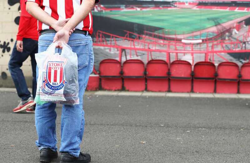
The current Stoke badge was introduced 23 years ago in 2001.
It was the Footy Headlines website that sparked the fury as they speculated over the new crest.
However, SunSport believes that Stoke will not be fully changing their logo.
And the ceramics nod is likely to just be an icon used on their latest kits rather than an entire new badge.
The club confirmed this as it released the images of the full kit for the 2024/25 season.
The ceramic design is only a minor addition and is placed on the collar at the back of the shirt.
The Leeds one certainly infuriated fans - but they are not the only ones to try and change the crest:
Arsenal
Unable to copyright their iconic traditional-looking shield badge, the Gunners shot back with a rebranded logo in 2002.
Although fans were initially upset, it is now a symbol of pride with the club managing to keep some key elements such as the cannon and the shape from their old one.
Man City
Man City changed their logo in 2016 after consulting with fans in a huge brand redesign.
The new badge reflects the club's history and identity, incorporating elements from previous designs such as the Manchester ship symbol and the red rose of Lancashire.
Inter Milan
The Serie A giants underwent huge change three years ago as long-term shirt sponsor Pirelli’s deal ended and the club announced a new club crest.
The traditional gold detailing on the old badge was ditched for a
Out was the gold detailing and the intricacies of the ‘FC’ and in was a bland and dull circle of lines which left fans fuming.
West Ham
The club bid farewell to Upton Park and moved to the much-bigger London Stadium back in 2016.
To usher in the new era, they also performed a tweak to their crest, losing the castle but keeping the two hammers and inserting them into an shield like logo instead that has now definitely grown on their supporters.
Juventus
This one from 2019 is arguably the worst of the lot.
The famous club’s oval, striped emblem was recognisable across the planet - but the unique logo was disgracefully replaced but just soulless letter J design that it is still worn now.
Cardiff City
It was owner Vincent Tan that controversially decided in 2012 to not only ditch the club’s traditional blue kit colours but to do the same for the badge too.
Fans of the Bluebirds were disgusted by the switch to red - but they had to wait three years until their Tan relented and changed back to blue.
Fulham
The London club's current crest was introduced in 2001 following promotion as they celebrated a return to the top-flight after 33 years.
The original coat of arms was ditched, much to the fury of fans, for the shield shape badge with a black and white background and the letters “FFC” in it that has now become synonymous with the club.

Chelsea
The blue circle design with a lion standing over the letters “CFC” was replaced in 2005 for the club’s centenary.
A year later it was then altered to the current design of a light blue circling featuring red details and the words “Chelsea Football Club” around the blue lion holding a staff.

Portsmouth
Pompey revealed a new badge that ditched their precious blue and yellow design in 2008.
The “three points” at the top of the shield were replaced with two straightened angles and “Portsmouth F.C.” written above the star on the shield.
It actually changed again in 2015, when it returned to a more traditional design, before being replaced with the 125th anniversary badge this season.

Brentford
The Bees redesigned their club crest for the first time in 23 years back in 2016 and it has proven to be a hit.
The simplified design incorporated a single honeybee over a red ring, in which the Brentford Football Club name and the founding year of 1889 were written around it.

Sheffield Wednesday
Fans were fuming in 2016 when it was announced that Sheffield Wednesday's shirts would no longer feature the iconic stylised Owl that had dated back to the 1950s.
The new badge was met with fierce criticism, although it did have a new owl image on their as well as maintaining the club’s Latin motto, “Consilio et Animis” which translates to “By Wisdom and Courage”, in a scroll form at the foot of shield design.

Hull City
They introduced a new crest without the club’s name on it for the 2014/15 season, much to the disgust of supporters.
But five years later it was reintroduced as they unveiled another new badge, this time based on the classic tiger's head that was first introduced in the 1970s.
